The chart shows the unemployment situation in Australia in the year 2012.
Summarise the information by selecting and reporting the main features, and make comparisons where relevant.
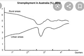
The line chart gives the percentage of joblessness in Australia in four quarters of 2012.
Overall, while there was a noticeable fall in rural areas, the urban areas experienced significant growth. At the end of the period, however, the proportion in the timberlands was higher.
In the first quarter, the unemployment level in the backcountry was about 6,5% whereas there was only around 2% of people in downtown unemployed. From April to June, the unemployment situation in agricultural regions witnessed a sudden decrease, from 6,5% to about 4,5%. On the contrary, the percentage in built-up districts increased by approximately 2%.
Three months later, the figure for the rural zones steadily grew by 0,5% and almost stayed the same in the last three months. However, in metropolitans, the figure was the same as in the first period (2%). This trend proved negligible as it rose again to 4,5%.
