The graph below shows US consumers' average annual expenditures on cell phone and residential phone services between 2001 and 2010.
Write a report for a university, lecturer describing the information shown below.
Summarise the information by selecting and reporting the main features and make comparisons where relevant.
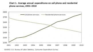
The provided line graph represents the result from the consumer expenditure survey about the difference in the mean yearly spending of two type of phones, cellular phones and residential phones, among the consumers from the US since 2001 till 2010. The expenses of the phones are counted in dollars and the information was taken from the US Bureau of Labor Statistics.
Nearly 200 dollars were spent on personal phones and the rate of payments kept on increasing throughout the years. Finally in 2010, less than 800 dollars were the dues from cell phones.
Although the house phones used to cost just about 700 dollars in 2001, the amount had dropped near 400 dollars in 2010. Only in 2006, the expenses of the both type of phones was the same amount which was just below 600 dollars.
So, to conclude, as the expending on mobile phones had increased, the payments for the family phones had been lowered correspondingly.
