the bar chart below gives information about the percentage of the population living in urban areas in different parts of the world.
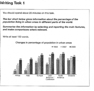
The bar chart tells us the percentage of urban areas population for six different parts of the world in 1950, 2007, and 2050.
According to the data in the chart, smallest population in 1950 was dedicated to Africa which had 15% people who had already lived in cities. It is also can be seen that Africa still had smallest population in urban areas in 2007 which only increasing to 37% and it probably will happen until 2050. On the other hand, North America had biggest population in the cities both in 1950 and 2007 (64% and 79% respectively). From the chart, it is also can be predicted that in 2050 North America still lead as biggest population. By those facts, we can infer that people in Africa prefer live in rural areas while people in North America think contrarily.
The figure for Oceania will have remained steady between 1950 and 2050, while Africa and Asia will have increased significantly with an increase about 20% for each three years. Although Latin America/ Caribbean had a lot of increasing between 1950 and 2007, it will only increase about 13% in 2050. It is seem that figure for Europe population and Latin America is quite similar with high increasing between 1950 and 2007 and will remain steady in 2050. Regardless of each changes of six part of world, it can be concluded that populations always increase around the world and it can be predicted until 2050.

in 2007 which only increasing to 37%
in 2007 which was only increasing to 37%
North America had biggest population
North America had the biggest population
as biggest population
as the biggest population
people in Africa prefer live in rural areas
people in Africa prefer to live in rural areas
The figure for Oceania will have remained steady between 1950 and 2050 while Africa and Asia will have increased significantly
Description: can you re-write this sentence?
It is seem that figure for Europe
It seems that the figure for Europe
flaws:
No. of Grammatical Errors: 6 2
----------------------
Attribute Value Ideal
Score: 5.0 out of 9
Category: Satisfactory Excellent
No. of Grammatical Errors: 6 2
No. of Spelling Errors: 0 2
No. of Sentences: 10 10
No. of Words: 243 200
No. of Characters: 1114 1000
No. of Different Words: 113 100
Fourth Root of Number of Words: 3.948 4.0
Average Word Length: 4.584 4.6
Word Length SD: 2.367 2.4
No. of Words greater than 5 chars: 64 60
No. of Words greater than 6 chars: 45 50
No. of Words greater than 7 chars: 31 40
No. of Words greater than 8 chars: 23 20
Use of Passive Voice (%): 0 0
Avg. Sentence Length: 24.3 21.0
Sentence Length SD: 3.407 7.5
Use of Discourse Markers (%): 0.5 0.12
Sentence-Text Coherence: 0.454 0.35
Sentence-Para Coherence: 0.62 0.50
Sentence-Sentence Coherence: 0.171 0.07
Number of Paragraphs: 3 4