The charts below give information about the diet and general health of two groups of students.
Summarise the information by selecting and reporting the main features and make comparisons where relevant.
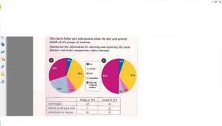
The chart illustrates the proportion of several kinds of food in the student’s diet in two groups as well as their general health.
The overview here is that in both groups, the fish is always surpassed by others in the rate. To specify, in group A, the cereals obtain the highest amount of 35%, followed by food with high content of fat with 30%. In addition, while the possession of vegetable in the diet is 22%, fruit and fish are only in charge of 8% and 5% respectively. In comparison, in group B, whereas the percentage of cereals stay unchanged at 35%, the biggest amount is acquired by food with high fat content with 50%. Interestingly, the rate of fish, fruit and vegetable is the same of 5%.
On the other hand, the table shows that the students in group A are healthier than the students in group B. To state clearly, the rates of overweight students and students who had illness in the past year in group A, are only 5% and 7%, which is less than the figure in group B with 12% and 20% respectively. Moreover, while the attendances of students in group A reach 90%, the percentage in group B is only 75%.
In conclusion, students who eat more vegetables will be healthier than the ones who do not.

Comments
The charts and the table…
The charts and the table illustrate the health status and the percentage of nutritional components in rations of two distinct groups of students.
Overall, group A predominantly eats cereals, while group B is prior to consume food with a high fat content. Moreover, the general health of group A seem to be better than group B.
Regarding two pie charts given, the proportion of greasy food in group A accounts for 30%, which is smaller 20 % than that in group B. In addition, the share of fish and cereals in both of groups are similar, with 5% for the former and 35% for the latter. Besides, the figure for vegetables in group A outnumbers that in group B, with 22% and 5%, respectively. As for the remainder, the gap between two groups are negligible, with 8% in group A and 5% in group B.
On the other hand, according to the table, the share of student being overweight and illness in the past year in group A just accounts for nearly a half than group B, with 15% for the former and 32% for the latter. In contrast, the percentage of attendance in classes in group A was remarkerably larger than group B, with and three quarters, respectively.
Attribute Value Ideal
Score: 8.0 out of 9
Category: Excellent Excellent
No. of Grammatical Errors: 0 2
No. of Spelling Errors: 0 2
No. of Sentences: 9 10
No. of Words: 223 200
No. of Characters: 944 1000
No. of Different Words: 109 100
Fourth Root of Number of Words: 3.864 4.0
Average Word Length: 4.233 4.6
Word Length SD: 2.578 2.4
No. of Words greater than 5 chars: 53 60
No. of Words greater than 6 chars: 43 50
No. of Words greater than 7 chars: 31 40
No. of Words greater than 8 chars: 20 20
Use of Passive Voice (%): 0 0
Avg. Sentence Length: 24.778 21.0
Sentence Length SD: 13.113 7.5
Use of Discourse Markers (%): 0.667 0.12
Sentence-Text Coherence: 0.405 0.35
Sentence-Para Coherence: 0.687 0.50
Sentence-Sentence Coherence: 0.071 0.07
Number of Paragraphs: 4 4