The chart below shows the value of one country’s exports in various categories during 2015 and 2016. The table shows the percentage change in each category of exports in 2016 compared with 2015.
Summarise the information by selecting and reporting the main features and make comparisons where relevant.
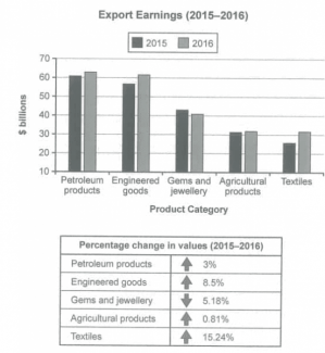
The bar chart depicts information regarding the export earning in a country between 2015 and 2016 and the table illustrates the percentage of changing each categories at similar period. Overall, the export value in most categories witnessed an upward trend with the exception of Gems and jewellery. In addition, export income of petroleum products and engineered goods were the two most highest fields among all given categories.
Petrolium products witnessed a moderate increase in export value, by 3% from 60 billions to 63 billions while the lesser contributor was engineered goods in spite of a faster-paced with 8.5%. Additionally, the figure for textiles went up significantly to over 30 billions (at 15.24%).
The remaining categories recorded lower export earnings. In term of gems and jewellery, this export earning decreased considerably from 43 billions to 40 billions (at 5.18%) whereas Agricultural products was the least increasing contributors, hovering at around 30 billions (with 0.81%).
