The line graph illustrates the proportion of total expenditure in a certain European country between 1960 and 2000
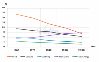
The line graph compares the percentage of spending on five different items in a European country over the period 1960 to 2000.
Overall, the rate of good and services all was spent on decreased significantly from 1960 to 2000, but there was a phenomenally fall in the percentage of expenditure on food in 2000.
According to the graph, the proportion of spending on food underwent a dramatically fall from 34% to 14% in 2000. Besides, there was a slightly drop in that of leisure and clothing at 11% and 5% respectively over a 40 years. Similarly, that of using fuel and energy declined minimally in 1980, then more constantly in the next 20 years.
In contrast, the year 1960 saw the rate of expenditure on transport rose slightly, prior to growing enormously to about 15% in 1990. After increasing rapidly, the percentage of transport was used by European's people climbed gently around 2%.
