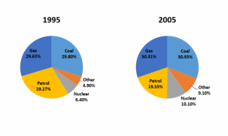
The pie charts below show the average household expenditures in Japan and Malaysia in the year 2010. Summarize the information by selecting and reporting the main features, and make comparisons where relevant.

The pie charts compare the average household spending in two different countries in 2010.
It is clear that housing accounted for the largest share of spending in Malaysia while the highest figure in Japan was other goods and survice. Obviously the figues of health care and transport in Japan were double those for Malaysia.
In Malaysia, the proportion of housing was the highest figure with 34% while this figures in Japan only accounted for 21%, over 10% lower than in Malaysia. Other goods and services in Japan was the highest percentage comprised 29% while in in Malaysia was lower with 26%. The number of food outlay in Malaysia was higher than the data that of Japan wasting took up 27% and 24% respectively.
In Japan, the figure of transport lavishing was double for Malaysia transport spending with 20% and 10% respectively. The number of health care in Malaysia accounted for a half of Japan wasting.
