The pie charts below show the comparison of different kinds of energy production of France in two years
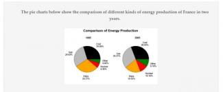
The two pie chart illustrate various types of energies are produced in France from 1995 to 2005. Overall, the energy production from petro decreased as opposed to gas, coal, nuclear and other section at the same time. In all types of energy production, there was only minimal change over the 10 year period.
As can be seen from the chart, the proportion of petro production dropped dramatically from 29.27% to 19.55%, while other sections (gas, coal, nuclear and other) saw a different trend. Coal and gas had a slight increase in the percentage of energy (merely 1%) but it accounts for a haft of the pie charts.
With regards to the remaining methods of producing energy, other fuel produced energy had the highest percentage of the increase among five kinds of energy production, by 4.2%. Likewise, in 1995, nuclear energy generated 6.40%, which rose significantly to 10.1% in ten years later.
