The pie charts below show the comparison of different kinds of energy production of France from 1995 and 2005
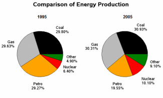
The pie charts illustrate how the energy produced by five various methods in France varied from the year 1995 to 2005. The data is in the percentage.
Overall, it is seen clearly from both pie graphs that the production by coal had the highest percentage in this list and other alternatives were at the last place throughout the given period.
To comments with, in the year 1995, as regards the coal production, it accounted for 29.80% and experienced a minor rise of nearly 1% in 2005(around 30.83%). As regards the overall proportion of gas, it comprised 26.27% in 1995, which increased to 30.31% in 2005. Moreover, the initial figure for nuclear and other alternatives in the generation of electricity was 6.40% and 4.90% and inclined of around 4% and 5% was observed at the end respectively.
Furthermore, petro related products, which had a ratio of 29.27% in the beginning, fell to 19.17% in 2005 in this list in France.
