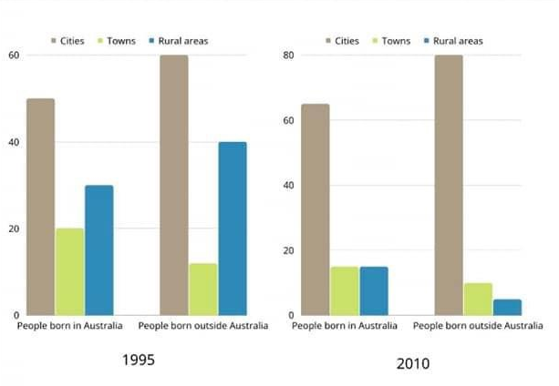
The bar chart below describes some changes about the percentage of people were born in Australia and who were born outside Australia living in urban, rural and town between 1995 and 2010.
Summarise the information by selecting and reporting the main features and make comparisons where relevant.
Link of the image:
https://iotcdn.oss-ap-southeast-1.aliyuncs.com/2023-01/task1_5.png
The given bar graph illustrates some changes about the percentage of people were born in Australia and who were born outside Australia living in urban, rural and town between 1995 and 2010.
Overall, the proportion of people who was born in the city was the highest in both different time, and different place.
In 1995, people from cities who were born in Australia were about 50% from cities, 20% from towns, and around 30% from rural areas. However, in 2010, the ratio of people from the cities increased slightly to above 60%. Moreover, in towns and rural areas, the percentage of people lived there dropped to 15%.
On the other hand, for people born ouside Australia in 1995, there was 60% of people lived in cities, about 10% in towns, and 40% in rural areas. In 2010, people who lived in cities was rose up to 80%, while in rural areas was sinificantly dropped to 5%.
| Post date | Users | Rates | Link to Content |
|---|---|---|---|
| 2024-01-04 | honguyenlily | 67 | view |
| 2023-11-29 | Alexanderpopov | 56 | view |
| 2023-11-02 | tracywu | 67 | view |
| 2023-10-23 | Giang Tran | 73 | view |
| 2023-08-22 | Linh12324r | view |

- Around the world many adults are working from home and more children are beginning to study from home because technology has become cheaper and more accessible Do you think this is a positive or negative development 84
- Computers are often argued to be the most important invention of the last hundred years To what extent do you agree or disagree with this statement Give reasons for your answer and include any relevant examples from your own knowledge or experience 67
- Around the world many adults are working from home and more children are beginning to study from home because technology has become cheaper and more accessible Do you think this is a positive or negative development 84
- Around the world many adults are working from home and more children are beginning to study from home because technology has become cheaper and more accessible Do you think this is a positive or negative development Give reasons for your answer and includ 84
- Rich countries often give money to poorer countries but it does not solve poverty Therefore developed countries should give other types of help to the poor countries rather than financial aid To what extent do you agree or disagree 81