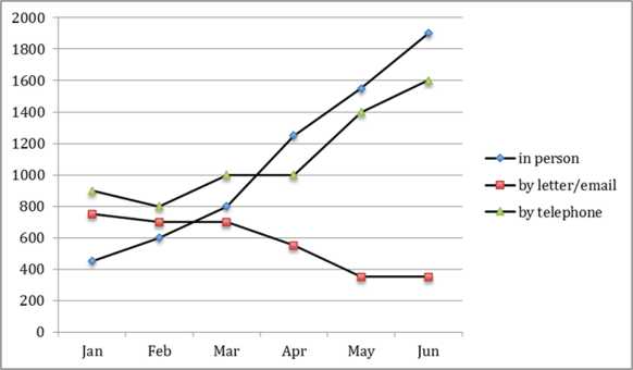
The graph below shows the number of enquiries received by the Tourist Information Office in one city over a six-month period in 2011.
Summarize the information by selecting and reporting the main features and make comparisons where relevant.
https://iotcdn.oss-ap-southeast-1.aliyuncs.com/2018-11/a1.jpg
The line graph illustrates the number of enquiries by three sectors according to Tourist Information Office in a city from January to June in 2011.
At the first glance, it is clear that the quantity of requirements in person and by telephone increased while the figure for by letter or email decreased. The most dramatic rise can be seen in the required turns by interview.
In January, telephone sector took the lead, with the figure of nearly 900 requirements. The number of enquires by letter and email was approximately 800, followed by that of in person, with just over 400.
Meeting for requests experienced the fastest growth when this sector surpassed two remaining ones in the middle of March (1000 turns) before reaching its peak of about 1900 in June. Turning to the telephone, the figure levelout between March and April at 1000, then it rose moderately to 1600 during the period shown. By contrast, a reverse pattern can be seen in term of letter and email. The figure for this type bottomed out at 400 by the end of the period.
| Post date | Users | Rates | Link to Content |
|---|---|---|---|
| 2024-03-26 | minhnhat2002 | 73 | view |
| 2023-07-12 | Đặng Ngọc Thanh Nhàn | 67 | view |
| 2023-04-09 | vuhungbo | 89 | view |
| 2023-04-09 | vuhungbo | 89 | view |
| 2023-04-09 | vuhungbo | 89 | view |

- The chart below shows the percentage of male and female teachers in six different types of educational setting in the UK in 2010 61
- The chart below shows numbers of incidents and injuries per 100 million passenger miles travelled PMT by transportation type in 2002 43
- The chart below shows the percentage change in the share of international students among university graduates in different Canadian provinces between 2001 and 2006 Summarise the information by selecting and reporting the main features and make comparisons 73
- The plans show changes to the layout of a theater between 2010 and 2012 67
- The graph below shows the number of enquiries received by the Tourist Information Office in one city over a six month period in 2011 Summarize the information by selecting and reporting the main features and make comparisons where relevant https iotcdn os