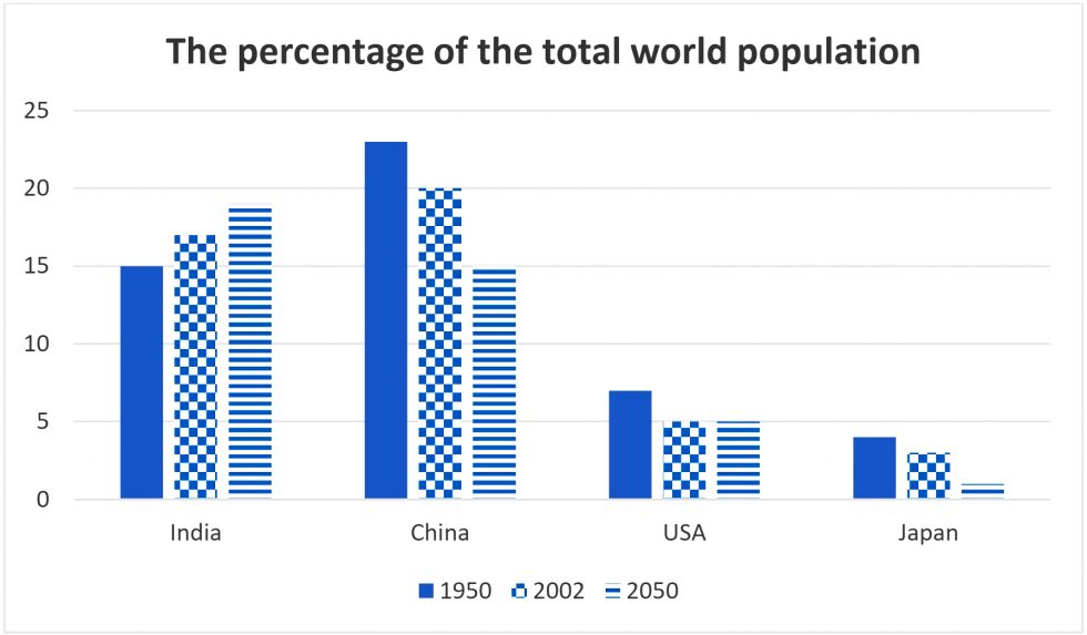
The bar chart shows the percentage of the total world population in 4 countries in 1950 and 2003, and projections for 2050.
Summarise the information by selecting and reporting the main features and make comparisons where relevant.
https://ieltsonlinetests.com/sites/default/files/2020-02/1207.jpg
The bar chart demonstrates how much the total world population was in 1950 and 2003, and predictions for 2050.
Overall, the population of India and China were all over 15%, whereas that of The USA and Japan were all under 10%. However, while the figure for Indian people followed an upward trend, that for the vast majority of the nations' people followed a downward trend.
Looking at the chart, it is immediately obvious that the proportion of Indian dwellers increased steadily between 1950 and 2003, and it is projected to reach 19% in 2050.
By contrast, there was a marginal fall from 23% in 1950 to 20% in 2003 in the population of China, and the amount is expected to drop by 5%. Nevertheless, while the figure for Japanese dwellers went down slightly by 1%, and this is forecasted to achieve 1%, that for the USA people will remain at 5% at the end of the period.
| Post date | Users | Rates | Link to Content |
|---|---|---|---|
| 2021-06-08 | gur1040894 | view | |
| 2021-06-08 | gur1040894 | view | |
| 2020-09-09 | Karamjeet11 | view | |
| 2020-07-30 | tangerinelinlin | view | |
| 2020-07-30 | tangerinelinlin | view |

- Some people think that physical strength is important for success in sport while other people think that mental strength is more important Discuss both views and give your own opinion 61
- The bar chart shows the percentage of the total world population in 4 countries in 1950 and 2003 and projections for 2050 Summarise the information by selecting and reporting the main features and make comparisons where relevant You should write at least
- The Pie chart gives information about the country of birth of people living in Australia and the table shows where people born in these countries live Summarise the information by selecting and reporting the main features and make comparisons where releva 78
- Some people believe that capital punishment should not be used Others however argue that it should be allowed for the most serious crimes Discuss both views and give your opinion 73
- Some people think that job satisfaction is more important than job security while some people think that they cannot always expect job satisfaction a permanent job is more important Discuss both views and give your own opinion 56